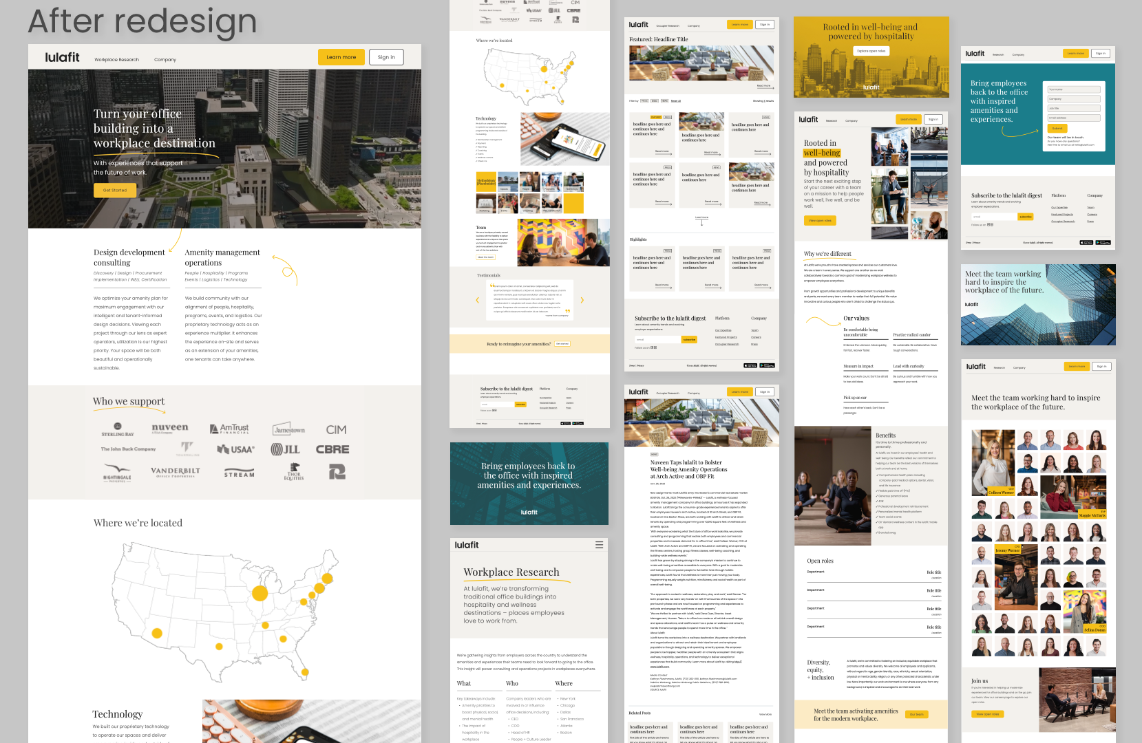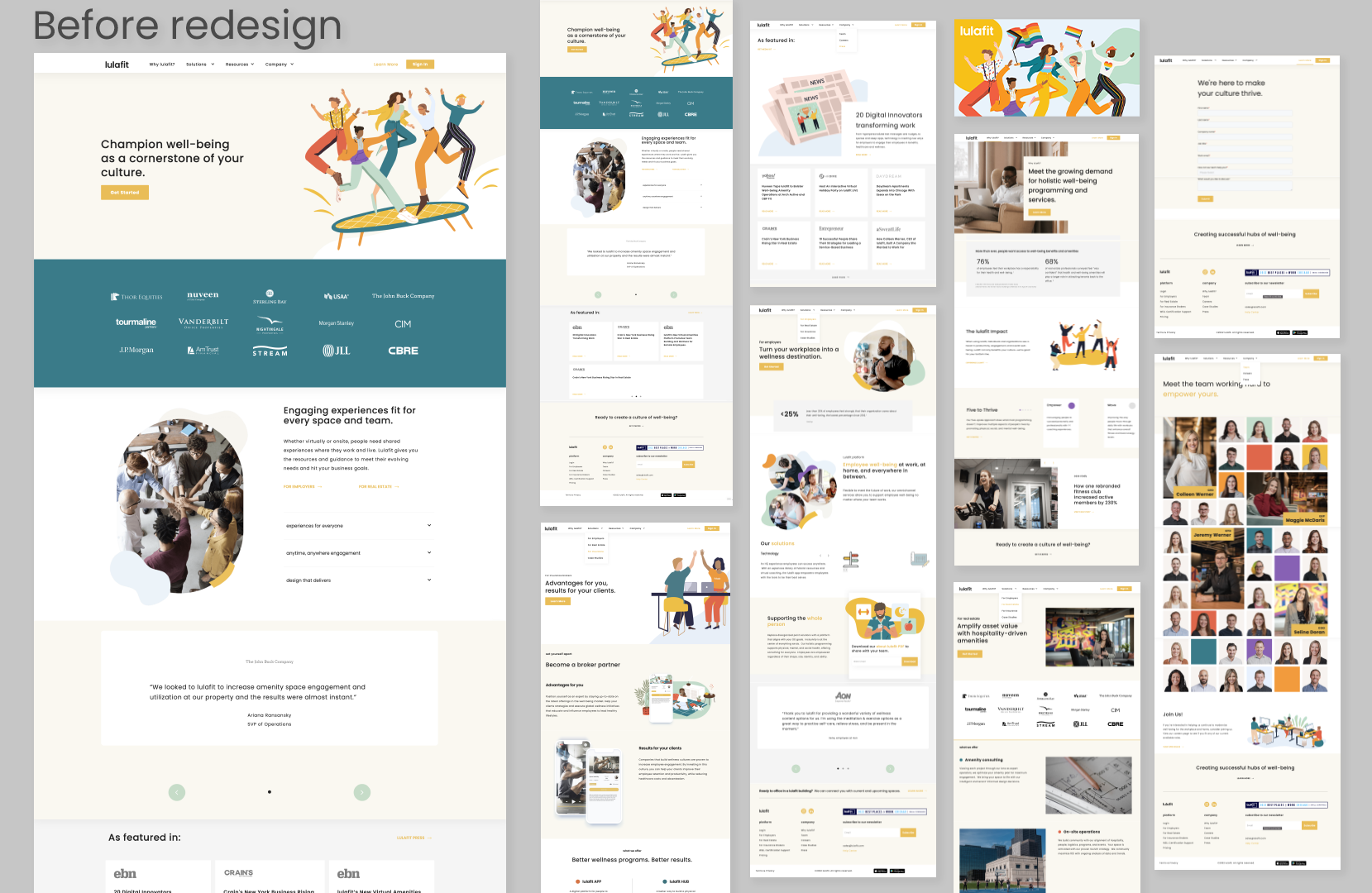


The update to the Lulafit website was driven by a desire to have the brand feel more sophisticated in order to be attractive towards a new target audience. There was also a request to move away from illustrations and use photography instead. The concept that I presented was to limit the brand colors to the main yellow accompanied by the neutral cream and dark charcoal. While the older branding did have a serif font defined, it was rarely utilized due to unclear use cases. The new serif had a thoughtful purpose so that it allowed for eye-catching contrast. Lastly, the use of organic blobs was retired in favor for thin, playful arrows and underlines which adds a lightness to the otherwise serious style.
